Global / English
Easy to Use for All - Tactile Marks on Shampoos
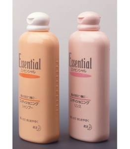
Have you noticed those little notches on shampoo bottles?
They are designed to inform you, by touch, whether you are clutching the shampoo or the rinse. These notches help not only the sight-impaired, but all consumers, as most of us close our eyes when lathering up.
Read on to discover how the notched bottles were born.
Voice of the Consumer (1989)
"The identical shampoo and rinse bottles are confusing. Please change the shapes!" "I can't differentiate between shampoo and rinse when my eyes are closed during shampooing." "I am sight-impaired…unique bottles would really help." In response to numerous such inquiries to our Consumer Consultation Hotline each year, we initiated packaging research geared toward product improvements reflecting the voice of the consumer.
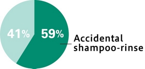
Consumer Survey on Unintentional Misuse (1990)
This survey of consumer misuse revealed that approximately 60% of consumers accidentally interchange shampoo and rinse during use.
Q. Have you ever mistakenly used shampoo for rinse, or vice-versa?
In a survey of consumer identification of commercial products, we discovered conflicting views: consumers imagined shampoo bottles either as "tall and slim" or as "short and stable."
Onsite Survey at a School for the Blind (1991)
As several bottle inquiries were from sight-impaired consumers, we conducted an onsite survey at a school for the blind.
They tried various tactile and positioning options to help differentiate between shampoo and rinse bottles with their eyes closed.
- Attaching Dymo tape embossed with Braille.
- Wrapping a rubber band around the bottle
- Using two different bottle shapes
- Asking family members to maintain pre-determined bottle positions
Searching for Identification Methods (1990 to 1991)
This sequential research was employed to determine a new standard of product identification via touch. We tested and considered various identification methods, experimenting with the specific feel of materials and protruding marks. We finally selected an innovation offering simple tactile recognition with a workable design for notched bottles.
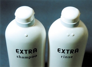
<Bumps on bottle shoulder>
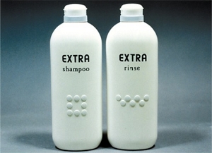
<Relief on bottle front>
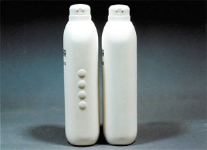
<Raised pattern on bottle side>
Patent Application for Utility Model (July 1991)
Two key features anchored the utility model patent application for our notched bottle: notches offered tactile recognition, while their rear-side and vertical positioning preserved bottle aesthetics without hindering processing tasks such as labeling.
Identifiable Bottles: from Debut to Familiarity.
Notched shampoo bottles made their market debut in October 1991.
Influence on the Industry
After Kao introduced notched shampoo bottles, it was clear that the entire industry needed to follow suit to avoid consumer confusion. We withdrew our utility model application and began promoting the notched shampoo bottle as an industry standard to major manufacturers through the Japan Cosmetic Industry Association. As a result, endorsement has been received from all manufacturers in the industry and nearly all Japanese shampoos now boast notched bottles.
We received many messages of joy and appreciation from consumers:
- Kao's efforts to explore the perspective of the user is wonderful!
- Incredibly handy for the sight-impaired!
- We were greatly inspired by Kao's concern for the sight-impaired.
- As I often confuse shampoo and rinse, this will be a great relief.
- My husband lost his eyesight a few years ago. Shampoo notches are a blessing. We truly appreciate this innovation.
The development of notched bottles introduced a new challenge - additional cost - as twice the number of molds were now required. Yet, rooted in consumer needs and backed by cooperation from survey participants, bottle manufacturers, and shampoo manufacturers, notched bottles have become an industry reality.
The tactile markings, or the notches on shampoos bottles were standardized by the Japan Industry Standards (JIS), and later became an international standard
Application of notches on shampoo bottles was published by JIS in 2000(JIS S 0021 Guidelines for older persons and persons with disabilities – Packaging and receptacles) as an example of "Special consideration for identification of contents in packaging and receptacles of the same or similar shape." The markings were also introduced in ISO standards (ISO 11156 Packaging – Accessible design – General requirements) as an example from Japan in 2011.
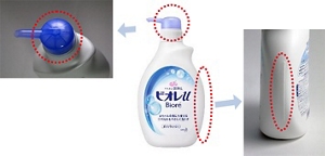
A line-shaped marking was adopted to indicate body wash and came to be included in the Japan Industry Standards (JIS)
In 2012, an organization of people with visual impairment voiced out the need for tactile markings on body wash products. This prompted Universal Design experts from various companies to come together at the Japan Cosmetic Industry Association to take action. Leveraging our experience of tactile marking development for shampoos and conditioners, Kao proposed a line-shaped tactile symbol. The proposal was adopted by the committee, and after various user tests involving people with visual impairments, it became a part of the JIS standards* relating to tactile symbols when the standards were revised in May 2014.
Kao started to use the marking in its products in 2015, starting from Bioré u Body Wash Pump Type, followed by other products.
-
* JIS S 0021:2014 Packaging - Accessible design - General requirements
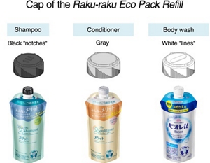
Easier identification of refill products
As of 2016, Raku-raku Eco Pack Refill for shampoos and conditioners also features notches on the caps for easier identification of shampoo and conditioner refills.
Moreover, efforts to expand these tactile markings on refill packages across different products just by touching is being made across the industry.
- Home
- Sustainability
- Making My Everyday More Beautiful
- Universal Product Design
- Easy to Use for All - Tactile Marks on Shampoos
- Home
- Sustainability
- Making My Everyday More Beautiful
- Universal Product Design
- Easy to Use for All - Tactile Marks on Shampoos