Changes to the Kao logo
While its shape has changed over the years, the moon-shaped logo that is used to symbolize beauty and cleanliness continues to be the Kao corporate logo.
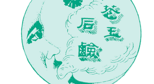
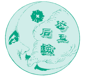

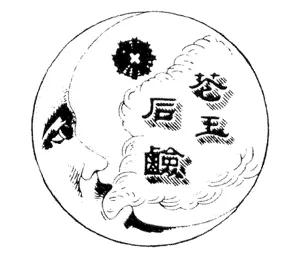
In 1887, Kao founder, Tomiro Nagase, opened Nagase Shoten, a Western sundry goods shop that would later become Kao. Taking inspiration from the moon and star logos that were printed on imported pencils sold at Nagase Shoten, Tomiro created Kao’s very first logo in 1890.

The very first Kao logo used on the label for Kao Sekken (Kao Soap).

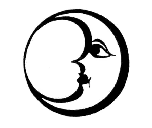
The moon’s face, which had faced right in the position of a waning moon, was changed to face left, in the position of a new moon. This is because a new moon grows into a full moon and is considered to be a symbol of good luck.


The top and bottom tips of the moon were connected in a round silhouette.

The face in the moon was changed to look more friendly, and the color was changed to vermillion orange.


The corporate name was changed from Kao Soap Co., Ltd. to Kao Corporation. The corporate color was changed to green to symbolize freshness and dynamism.

The logo representing the Kao Group was changed to the word "Kao," written using the English alphabet, to create a globally consistent corporate image.
The logo for Kao's Consumer Products Business and Chemical Business in Japan and Asia was changed to a combination of the Kao Moon and the word "Kao," written using the English alphabet.

The "Kao" logo was adopted across the Kao Group. This included its use as the logo for the Consumer Products Business and Chemical Business in Japan and Asia.

- Home
- About Kao
- Our Purpose and Value Creation
- Corporate Message, Logo and Symbol
- Changes to the Kao logo
- Home
- About Kao
- Our Purpose and Value Creation
- Corporate Message, Logo and Symbol
- Changes to the Kao logo


